At last defeated…
As you read from my post yesterday, Tina sided with Jake on the post card’s design disagreement. She too thinks it’s too busy. Welp! Time to change it! I know what you’re thinking… “really? It was that easy to change your mind?” Why yes, yes, it was! Jake and I agreed to take Tina’s recommendation as direction and Tina thought the same as Jake so I changed my stance and re-edited it.
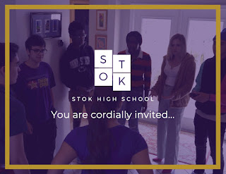
One thing Tina did point out that neither Jake nor I had thought about because we were to busy talking about the back is that the front looked too simple, it wasn’t engaging enough. Jake and I were quick to agree, if the front wasn’t engaging, people wouldn’t even turn to see the back where the information was. So following Tina’s recommendation, I added a picture to the front. I made the picture the background and added the heavy purple filter that can also be seen through the website to develop a sense of branding across all the products of the project. The filter also allowed to see the writing and the logo clearly while still maintaining the engaging nature of a photograph in the background.
One thing Tina did point out that neither Jake nor I had thought about because we were to busy talking about the back is that the front looked too simple, it wasn’t engaging enough. Jake and I were quick to agree, if the front wasn’t engaging, people wouldn’t even turn to see the back where the information was. So following Tina’s recommendation, I added a picture to the front. I made the picture the background and added the heavy purple filter that can also be seen through the website to develop a sense of branding across all the products of the project. The filter also allowed to see the writing and the logo clearly while still maintaining the engaging nature of a photograph in the background.
Unable to decide which photo worked best, I made 6 different versions and sent them to Jake so that we could discuss them.
 We both agreed that our production pictures looked a bit off in the context of the invitation and we didn’t want to recycle content we already heavily used on the site. So instead, we both liked the background of the graduation hat. The film’s site uses a similar picture in one of the pages so the branding stays consistent, but it also helps establish what the film is about even before the viewer sees the tittle or reads the synopsis on the back.
Speaking of the back, it was an easy fix! I just moved the big bold font and rearranged some stuff. I made the logo bigger and center it, right under it I put the synopsis and under that, I used the same font that I removed from the upper left corner but smaller to name the film festival the screening would be playing in. I also eliminated the “popcorn | Q&A Session” lines at the Botton of the address information due to spacing. It took all of 5 minutes and to be honest, I do like it quite a lot, it looks great!
Well, that’s it for today! We have edits to make this weekend, I’m hoping it’ll all be smooth sailing but I’m ready to put up a fight in case editing the last scene gets a bit rocky.
Signing off,


No comments:
Post a Comment